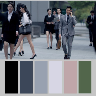
Commercial Video Production : Color Palette Analysis Part 2
- Barker Production
- Apr 19, 2022
- 2 min read
Updated: May 13, 2022
It's time for another edition of color palette analysis. As long as you aren't doing something clearly technically wrong, and you match the client's company colors and actual product color, your color palette is entirely subjective. It depends on the mood you're trying to convey and the overall stylistic choices. I think cultural, age, gender, and other variations of color preference are fascinating, as is how what media a video appears on influences color preferences. It's been argued that simpler and warmer color palettes do better on small screens like Instagram on a mobile phone screen.
I recently directed a commercial aimed at Southeast Asian markets like Malaysia, Indonesia, and Thailand, and the client and test groups strongly preferred pale pink, magenta and whiter color palettes, but when the same commercial was shown to an American audience, they voiced a preference for a warmer tone with oranges and greens. To what degree do monochromatic or cooler tones signify "technology"? To what extent are yellow, orange and red tones imply human connection or family? These concepts differ significantly across different ethnic, age, and gender groups, so getting the most out of a commercial video requires a deep understanding of the target market, but this has to be balanced against the story the director is trying to tell as well as his/her personal style.
Taiwan Taipei Video production commercial film producer director cinematographer videographer fixer digital marketing agency preproduction production postproduction Video interview photo photographer creative agency studio video production Taiwan Taipei Kaohsiung Taichung Taijung Taibei 巴克影像台北台灣影片製作公司 制作 影片 剪接 後製 宣傳影片 商業攝影、廣告、拍攝、行銷影片、產品簡介影片、企業形象影片、微電影、紀錄片 創意 影像創意 影像 台灣 導演美術指導訪談廣告影片後製作新北市


Comments